Showing posts with label Posters. Show all posts
Showing posts with label Posters. Show all posts
Friday, 4 April 2014
Wednesday, 26 March 2014
Poster Design Theory
Before creating our poster, we decided to look into design theory of posters, in order to help us create an effective poster for our production.
From this video we came across on YouTube, we noticed the significance of having key elements of the film in the centre of the poster's design, making it a focus of the poster. We also have from this considered how important it is to have appropriate colours and image to suit the genre of the film, so that when people look at the poster, they immediately are interested and have an understanding of the genre.
From this design theory video we considered the important aspects of our film poster and what needs to be included and how, as shown below.
Wednesday, 19 March 2014
Problem Resolution
We used a font specific to iMovie as our recurring font throughout the trailer, we wanted to make sure we continued this theme and therefore linked our ancillary texts to our trailer effectively, however this was made more difficult as the font itself was not possible to download onto any Macs or PCs.
We overcame this problem by entering all text we wanted in this font, in our ancillary texts, onto a black screen on iMovie, we then screen shot each piece of text, saving it as an image before we could use it.
We also had to upload the image to LunaPic, a free online photo editor, this allowed us to make the background of the text transparent, making it more easy to insert into our poster and website.
CAP£TAL Inspiration
When creating our poster, we looked at a variety of other posters and techniques they had used to make their poster stand out and appear unique.
We took specific inspiration from the Se7en poster:
For this poster we looked at how the title of the film had been made into an iconic image which stands out, capturing people's attention. We decided this was something we wanted to include in our own poster design.
We chose to change the title Capital to be written as Cap£tal, as this highlighted the dominant theme of our trailer, money, as well as making the pound sign stand out as it is a central image, as used in the Se7en poster. We were also conscious to ensure that the word was still readable, as we wanted to make sure our film's name is easy to remember from our poster.
Sunday, 16 March 2014
Poster development
The Powerpoint below shows the changes we made to the poster from our initial design to our end product
Thursday, 13 March 2014
Research on posters
As well as analysing existing posters to find out the conventions, we also looked for advice and information about how posters are laid out.
On the Wikihow UGC site, we found a number of articles about film posters, but the one below seemed the most valuable:
And this is what we decided from it
Saturday, 8 March 2014
Poster Research - Historic and contemporary examples of film posters
I have researched film posters of the past and present from varied genres, and found these examples. There is a clear evolution of film posters over time, with changes in style and use of colour. Film posters from the years 1930-1970 are presented as more of a spectacle and a theatrical production, however over time, and shown through posters from 1990-2013, posters have become less artistic with them all being photographs, and relying on technology.
A wider range of colours are used in the historic film posters, the posters appear as a piece of art work, with images being drawings, particularly in the case of the 1930's film 'Hell's Angels'. The most recognisable names associated with the film are in the largest fonts, shown in 'On The Waterfront' and 'Citizen Kane', making it an important factor in film promotion, however in more recent posters this is not shown as explicitly.
There are similarities between the two collection of posters, as genre is obvious through the colours used. The poster for 'The English Patient' is clearly a romantic film by the soft light colours, and the images of a man and a woman being joint protagonists, this is also seen in 'Casablanca', showing these features of posters having a constant meaning over time.
Thursday, 6 March 2014
Wednesday, 26 February 2014
Poster Research - Existing Poster Mood Board
I have created a mood board of existing media posters as research for creating our own product. Most of these posters contain an image of the main character or characters in each film and the colour scheme is reflective of the film genre. Tag lines are a feature of many of these posters as a promotional tactic, as well as positive reviews.
Tuesday, 21 January 2014
Thursday, 19 December 2013
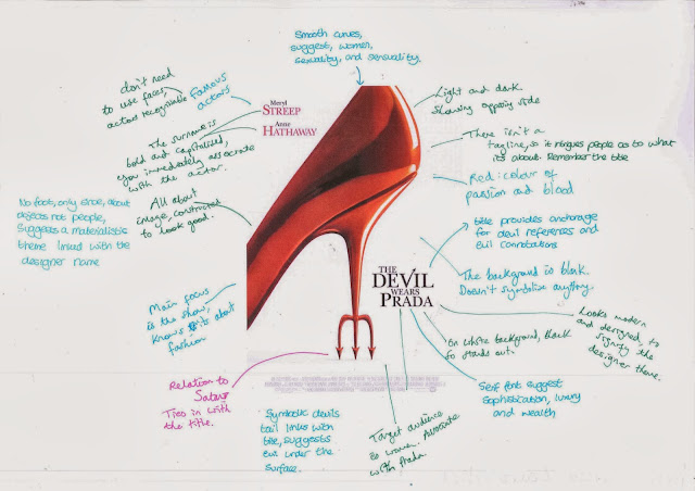
Analysis of Posters
We took different genres of film and there posters and looked at what they all seperately represented and what impression it gave of the type of film, characters and classification.
Trainspotting
Gone with the Wind
Devil wears Prada
Kidulthood
Subscribe to:
Posts (Atom)


